How to make icons for the Web [part 1]
Part I: Create and optimize for Retina displays
There are different ways to manage icons in webdesign: with svg files, or with an icon font. Here we choose to make it simple and classic, with some “time saving” techniques.
In the first part of the tutorial, we’ll see how to create and optimize icons for Retina displays. And in the second part, we’ll see how to integrate these images in our website with CSS and the auto-spriting technique from Compass.
You can see what we are doing here: demonstration
Designing the icons
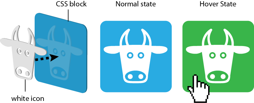
The idea is to use white icons with transparency over a flexible CSS background (which we can easily change):
Step 1: Minimal sketching
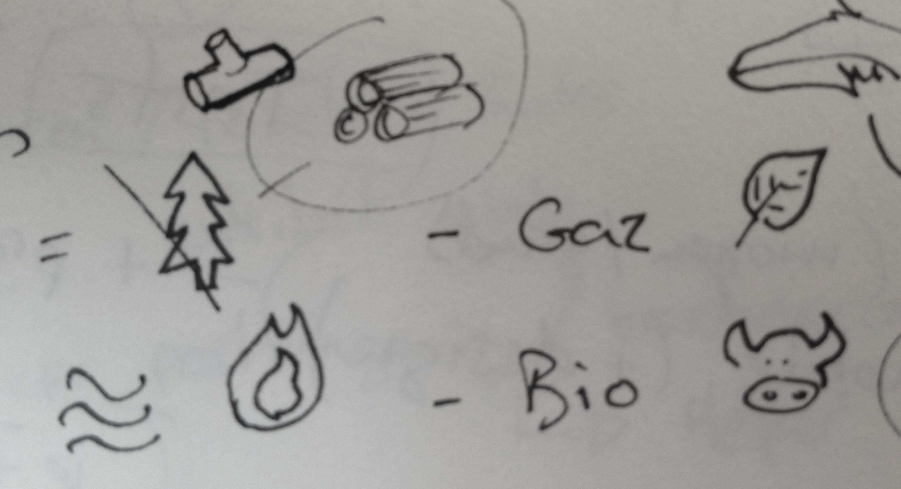
The first step is to sketch with very simple lines. Each symbol must be recognizable at its smallest size.
Step 2: Vectorization
Use your favorite software to vectorize the icons. Check out Sketch for Mac, a promising alternative tool to the combined use of Illustrator and Fireworks.
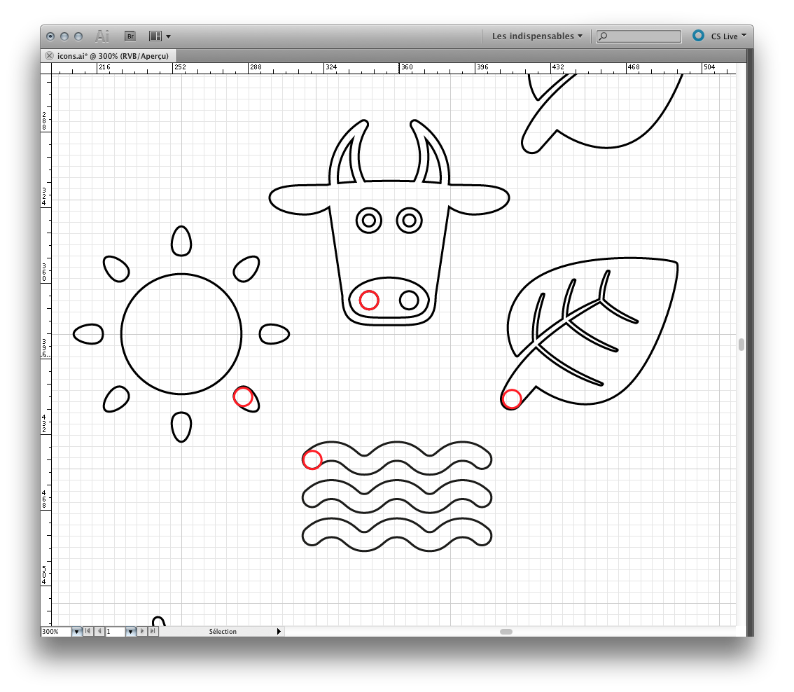
Try to keep visual consistency between your graphic elements. When compared side by side, the icons should have a similar style, visual strength and level of detail.
The red circle in the example shows how the forms are proportional.
Step 3: Pixelization
The next step is to scale our vector shape to their destination size. As the vectors are not exactly aligned with the “pixel grid”, the resulting lines can be blurred. To resolve this we can use the “snap to pixel” function (in Fireworks: cmd+k) or align it manually.
![]()
The left ear looks sharper than the right one, because we have aligned it with the pixel grid.
Exporting and optimizing files
Now, let’s create the images!
Optimized images in PNG-8
For transparency we need PNG files, but for one-color icons we don’t need more than 8-bits PNG. This has the benefit of working on Internet Explorer 7 and being very light.
When exporting our image, we just choose “alpha transparency” and make sure there is no “cache”:
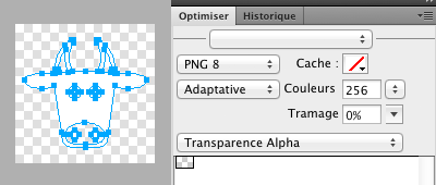
Fireworks export panel for optimized PNG-8
Dealing with Retina
For Retina displays, we have to export two images. One at normal size and the other twice as big. This second one will have the same absolute width and height, but a greater pixel density. We append “@2x” to the file name of the Retina image version.
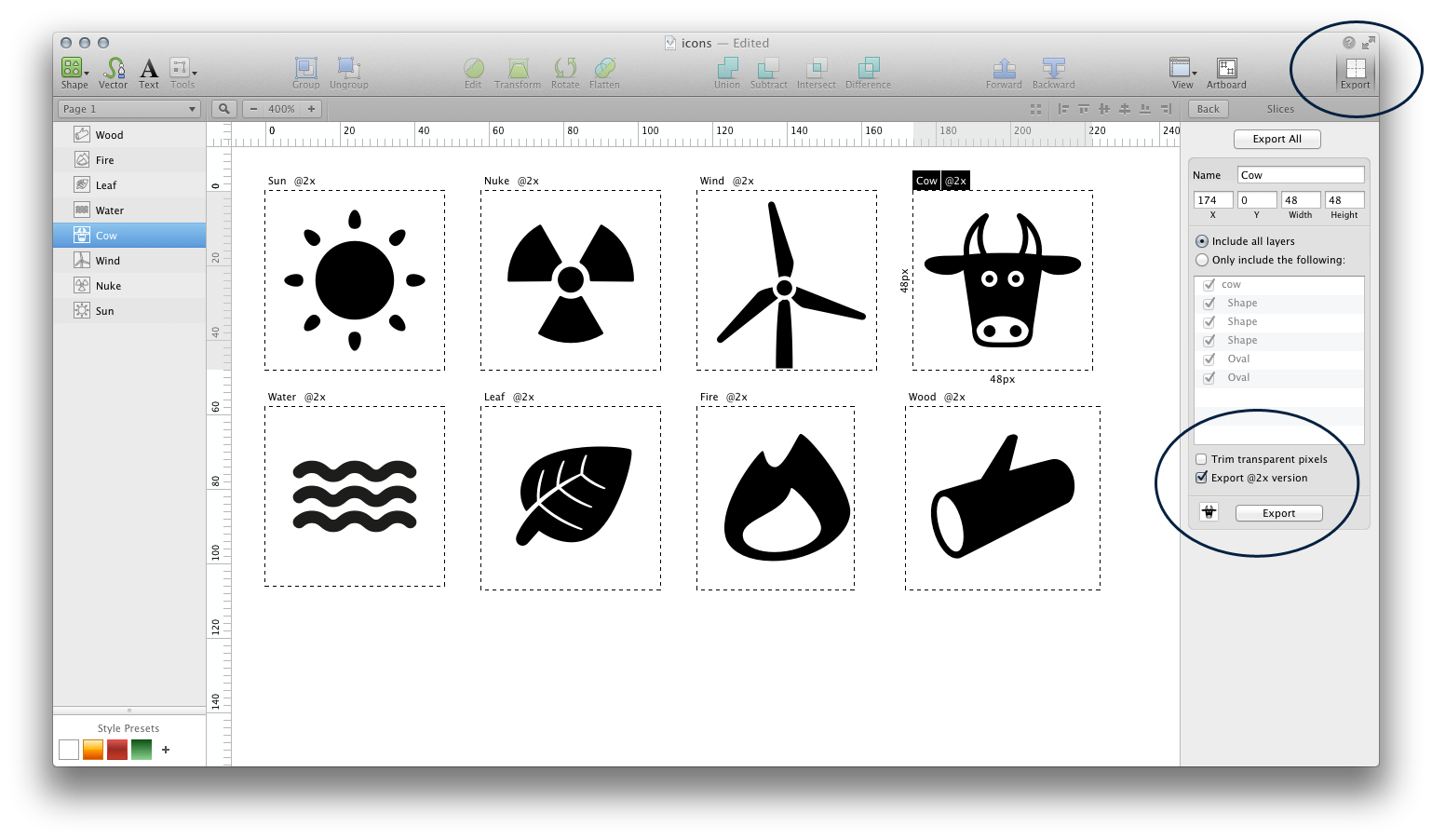
Tip: Sketch lets us export a “@2x” version of an image automatically, by checking the option in the export panel.
Now all our icons are ready for the frontend!
![How to make icons for the Web [part 1]](https://www.wearecube.ch/blog/how-to-make-icons-for-the-web/hero_hua8cf04f6c7444a7f631e27b1d439dffd_167288_1000x0_resize_q90_h2_lanczos_3.webp)
