Lessons learnt in responsive design
We designed and coded many responsive projects lately, and learnt a lot in the process. Here are some points to consider before you embark on a responsive design project.
Before you start
Make sure you benefit from the approach
Don’t just do it because everyone else does. You can also consider making a separate mobile website instead. Here are the pros and cons of both approaches.
Benefits of responsive
- Your site works on a variety of devices and screen sizes.
- One content to publish, maintain and host.
- Improved SEO: you have the same URL regardless of the platform.
- You cannot predict what devices will come in the future.
Disadvantages of responsive
- A responsive website or app means a lot of work.
- It is hard to retrofit an existing website. It’s easier to start from scratch.
Reasons to opt for a separate mobile website
- It’s easier to optimize the contents and images for fast loading times.
- You need a mobile site running quickly.
- You cannot afford a complete overhaul. Especially when you have tons of content.
- You want to offer different experiences on different platforms: A typical example is an airlines website. On the desktop version you would find a lot of information, promos and details about the company. The mobile version would focus on the essential, i.e. booking tickets and looking up schedules.
Disadvantages of a separate mobile website
- You need to publish, groom, maintain and host two versions of the site.
- URL social sharing problematic: when sharing a link from a mobile site on a social siteyour followers will be directed to the mobile site even if they view it on a tablet or laptop.
- It’s still not optimized for tablets or other devices.
Consider mobile first
The core idea is simple: Rather than starting with the full-size version of a website and then adapting it for mobile, you start with the mobile experience, then build up from there. This is the approach we chose for our website.
Benefits of mobile first
- Your experience is optimized for mobile users.
- It forces you to focus on what matters. There’s no room for content junk.
When not to go mobile first
Mobile first doesn’t work for all projects. If you are making a complex business app, you can’t tell your customer to drop 80% of the functionality just because it’s hip. For feature-rich or content-creation apps, you’ll be better off by starting with the large version.
Adapt your workflow
Plan enough time and resources
Responsive webdesign is time-consuming. You will need at least twice as much time, sometimes more. Take this into account when you plan your project.
Sketching
You have to create multiple sketches for each screen. In the early stages, it suffices to sketch the extremes: a very small and a very large size. This saves you time, since you know you can interpolate the sizes in-between later.
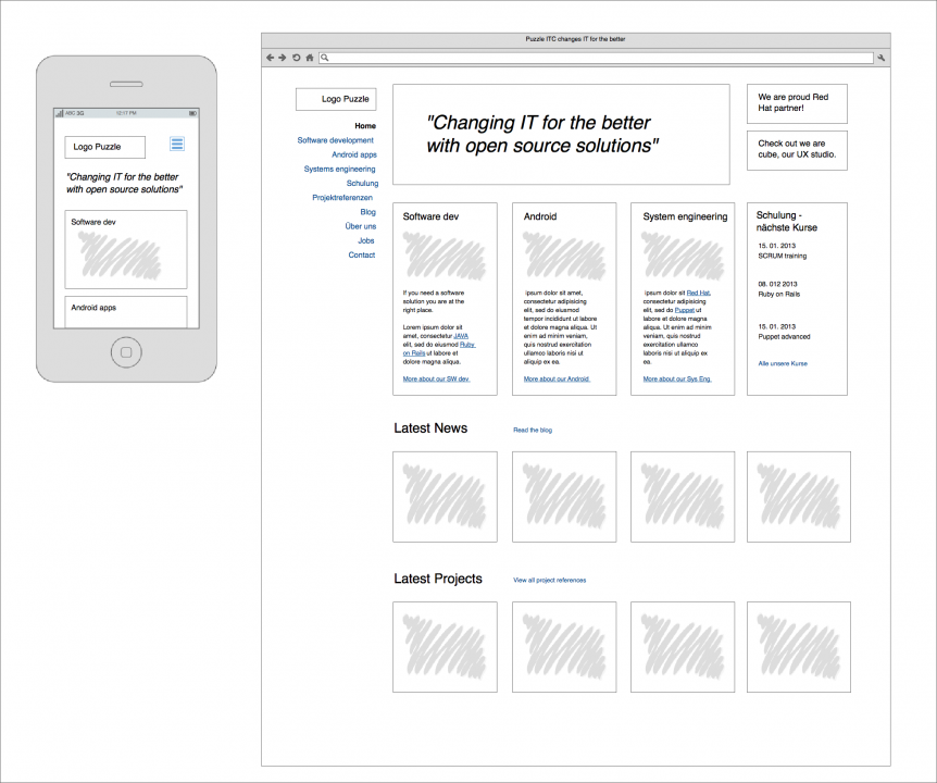
You also don’t have to make detailed wireframes for each screen resolution. Pick up a screen size to start with, then make thumbnail wireframes for the other screen sizes. This will save you precious time.
Design in the browser
If you are comfortable with code, I advise you to design in the browser. Of course you can (and should) create styles in your favorite graphics program, it’s a lot easier. But stay pragmatic: Don’t agonize over the layout and the dimensions, they will vary with the resolution.
Consider polishing the design in the browser instead. This has the following benefits:
- You can check your progress on various devices immediately.
- Many little issues only arise when running real code in a real browser.
- When you change the CSS for an element, the change is applied throughout the whole project.
- Design and code are done at the same time.
Close collaboration is key
If the designer and the developer are different people, they must work closely during implementation. A responsive project requires a significant amount of back and forth: Style an element, code it in CSS, test it on devices, fix problems.
Testing
Don’t underestimate testing. Reserve plenty of time for it. It’s no longer modern browsers vs. IE. Now you have a myriad of platforms, devices and browser versions. Test your website on as many different devices as you can.